Component anatomy
This section names the visible areas of the component. The same names are used in the token documentation so each token can be mapped to the part of the UI it affects.
Containers
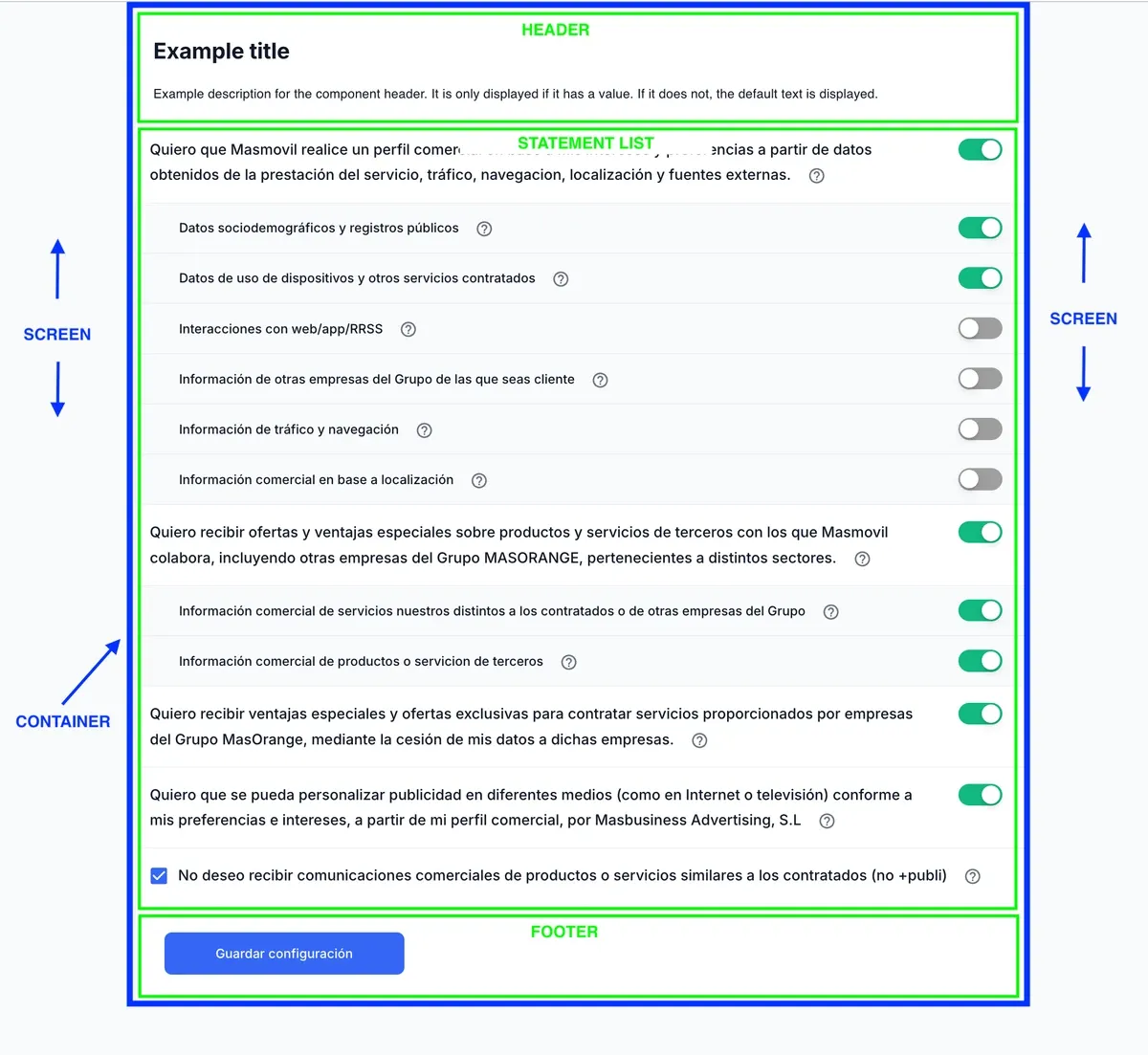
| Area | Description |
|---|---|
| Screen | Outer background of the embedded component. |
| Container | Central block that groups the header, statement list, and footer. |
| Header | Top section with the title, optional description, and language selector. |
| Statement list | Central section where consent statements are rendered. |
| Footer | Bottom section with the validation alert and CTA button. |
Header
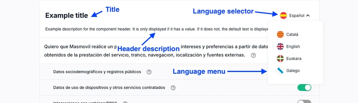
| Area | Description |
|---|---|
| Header | Top area that groups the title, header description, and language selector. |
| Title | Main heading displayed at the top of the component. |
| Header description | Optional explanatory text displayed below the title. |
| Language selector | Control used to change the component language when multiple locales exist. |
| Language menu | Dropdown that displays the available language options. |
Statements
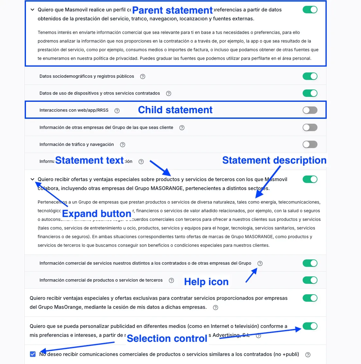
| Area | Description |
|---|---|
| Parent statement | Main consent item. It can group related child statements. |
| Child statement | Consent item nested under a parent statement. |
| Statement text | Main text that identifies the consent statement. |
| Statement description | Explanatory text that provides more detail about the consent statement. |
| Expand button | Control used to show or hide additional statement content. |
| Help icon | Icon that opens or displays additional information about a statement. |
| Selection control | Control used to accept, reject, or enable a statement. It can be a switch or a checkbox. |
Statement cards
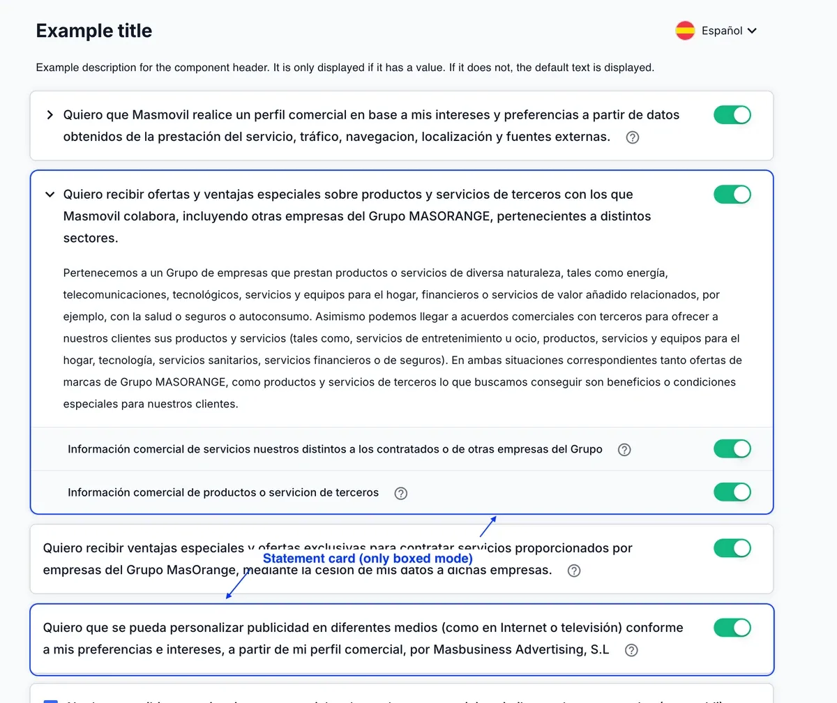
| Area | Description |
|---|---|
| Statement card | Visual container that wraps a consent item in boxed mode. In flat mode, statements are not shown as cards. |
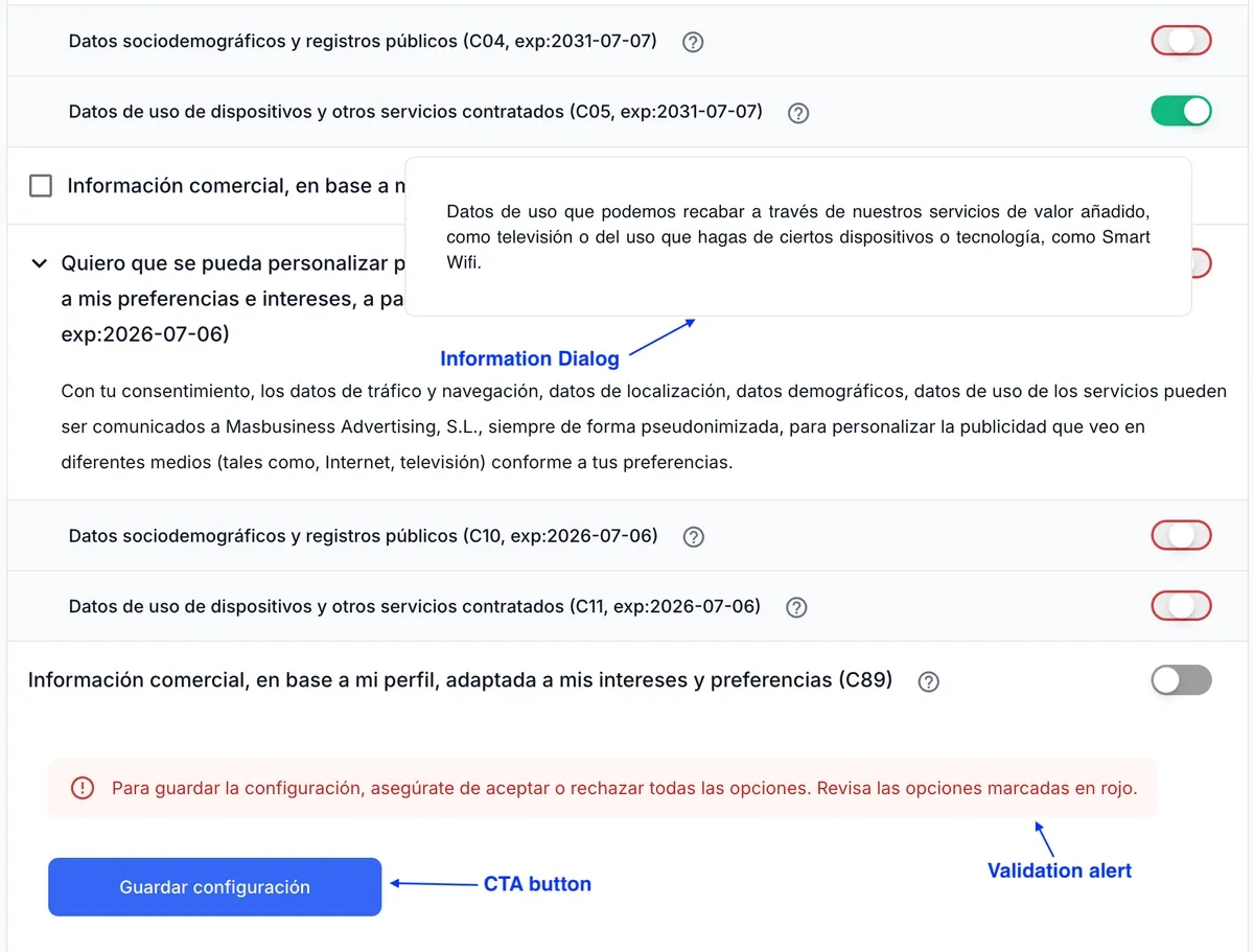
Actions and feedback
| Area | Description |
|---|---|
| Information Dialog | Floating panel that displays additional information about a consent item. |
| Validation alert | Message shown when the user must review or complete consent selections. |
| CTA button | Primary action button used to submit or save the current consent selection state. |